
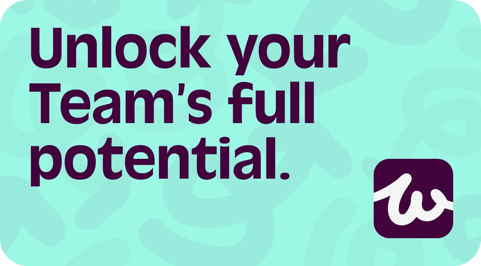
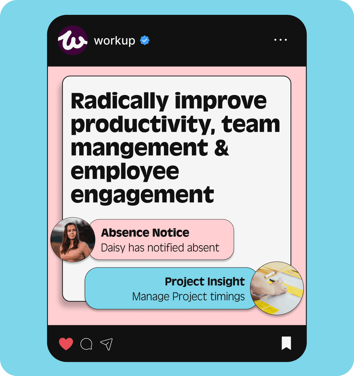
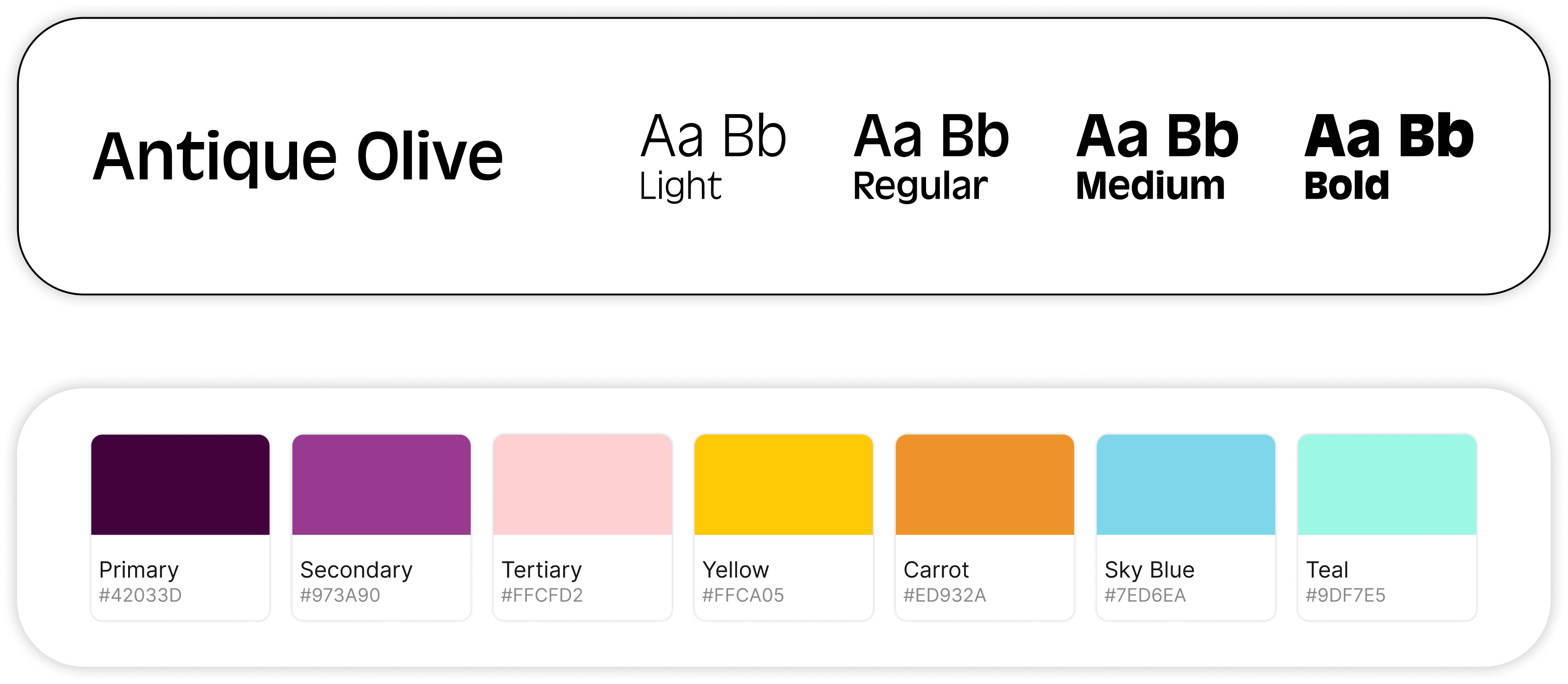
COLOURS & TYPEFACE
After running workshops with the business owners, we understood that the most important message they wanted to communicate was that Workup was fun, easy to use & not another boring corporate tool. With the use of a vibrant colour palette & sans-serif font this helped to deliver this message through their new branding.
DESIGN SYSTEM CREATION
Building a scalable design system
After establishing the visual identity, we then translated the brand into a reusable design system for the SaaS platform.
The system included components such as:
Buttons & switchers
Navigation Patterns
Dashboard Widgets
Modals & forms


TEXT COLOUR AUDIT
Improving accessibility in the product
As the project evolved, new use cases revealed inconsistencies in text colour usage and accessibility. A full audit was conducted to highlight these issues, which resulted in a updating the semantic tokens for text across the platform.

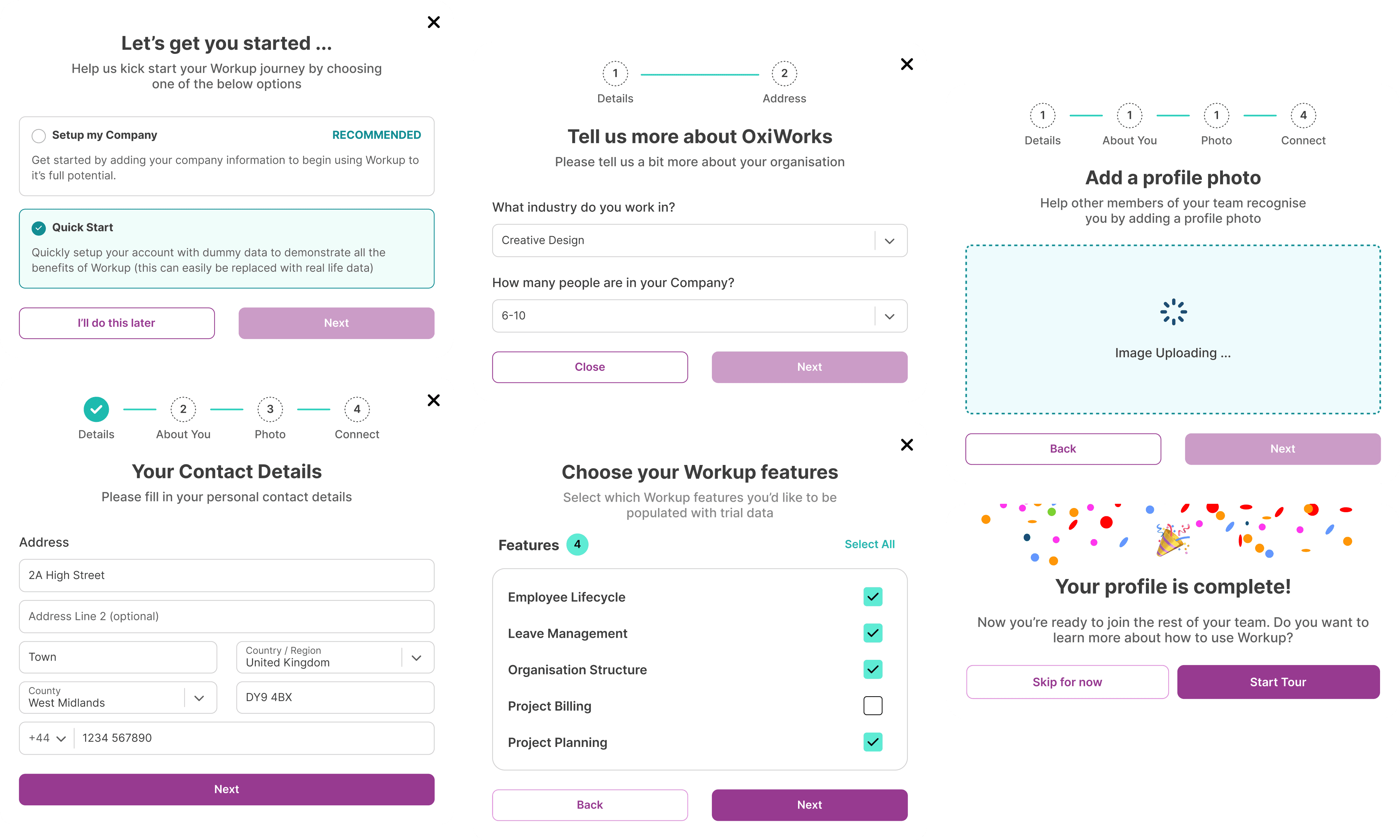
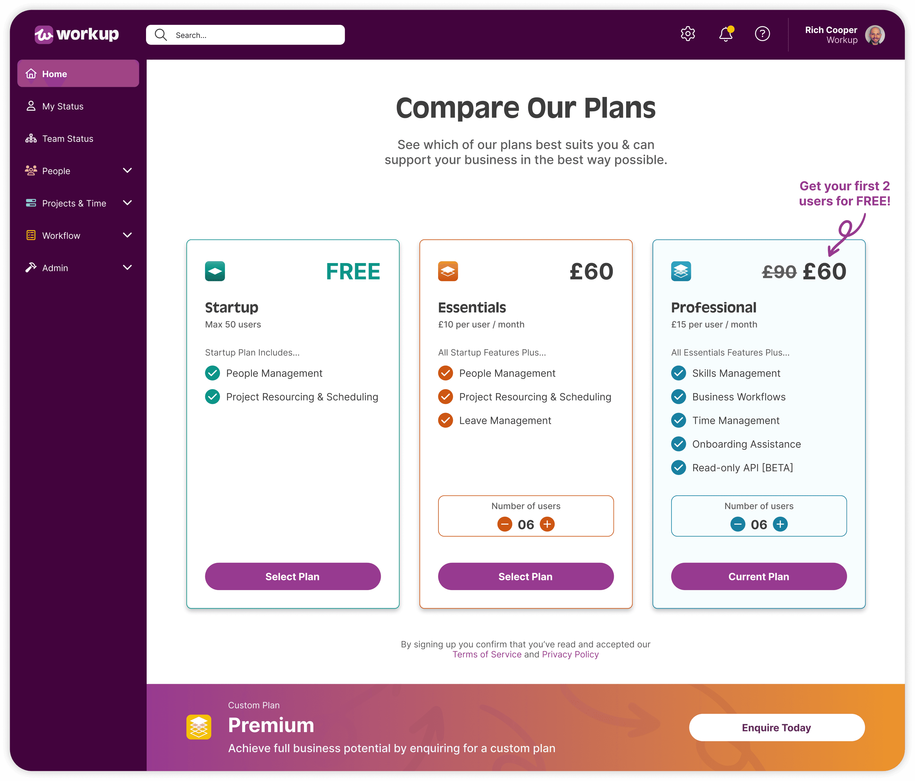
ONBOARDING & ADOPTION
As Workup are a start up company, it was important to implement the right onboarding flows to attract users. To provide that tailored user experience, it was essential to establish to right flows for both business owners & employees.
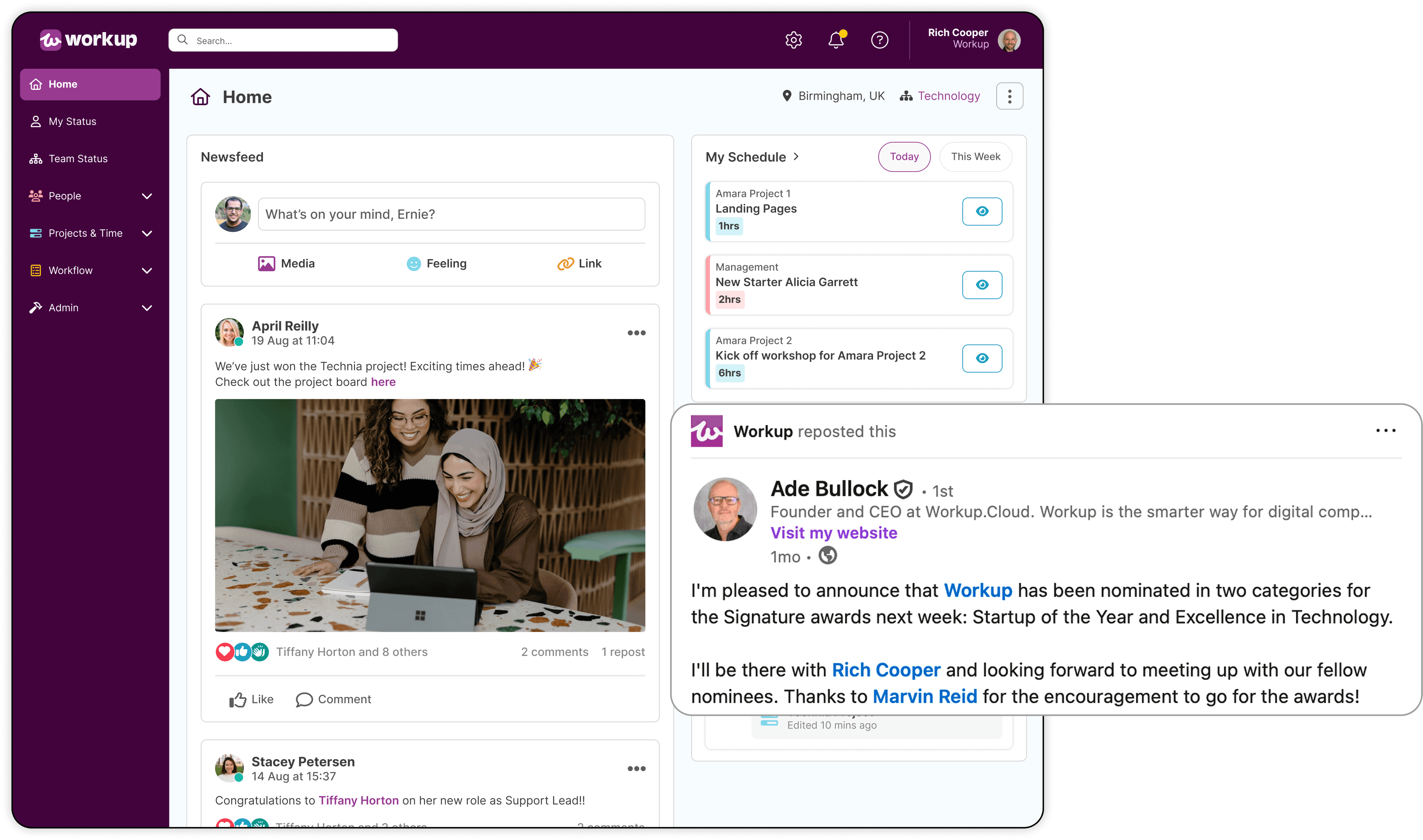
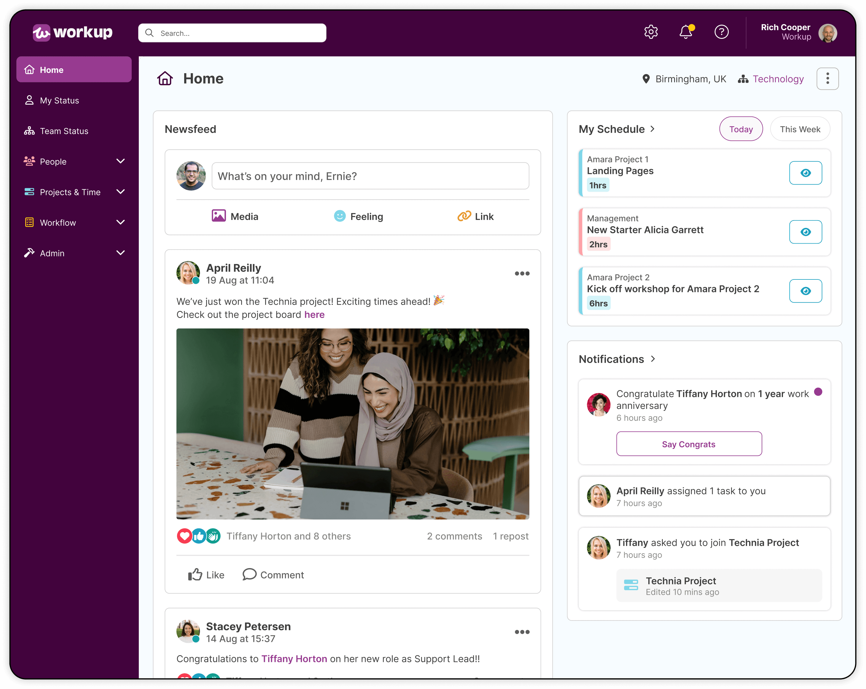
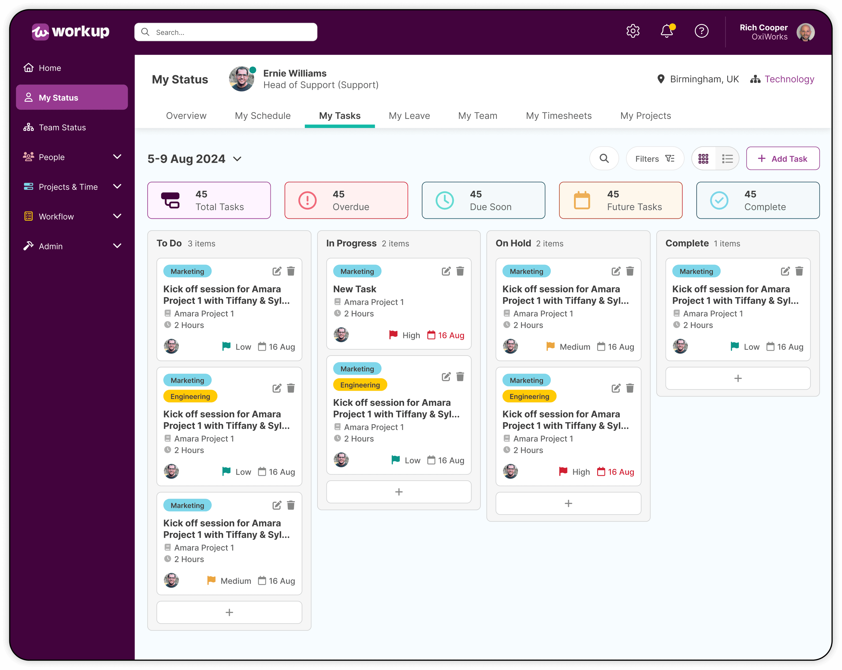
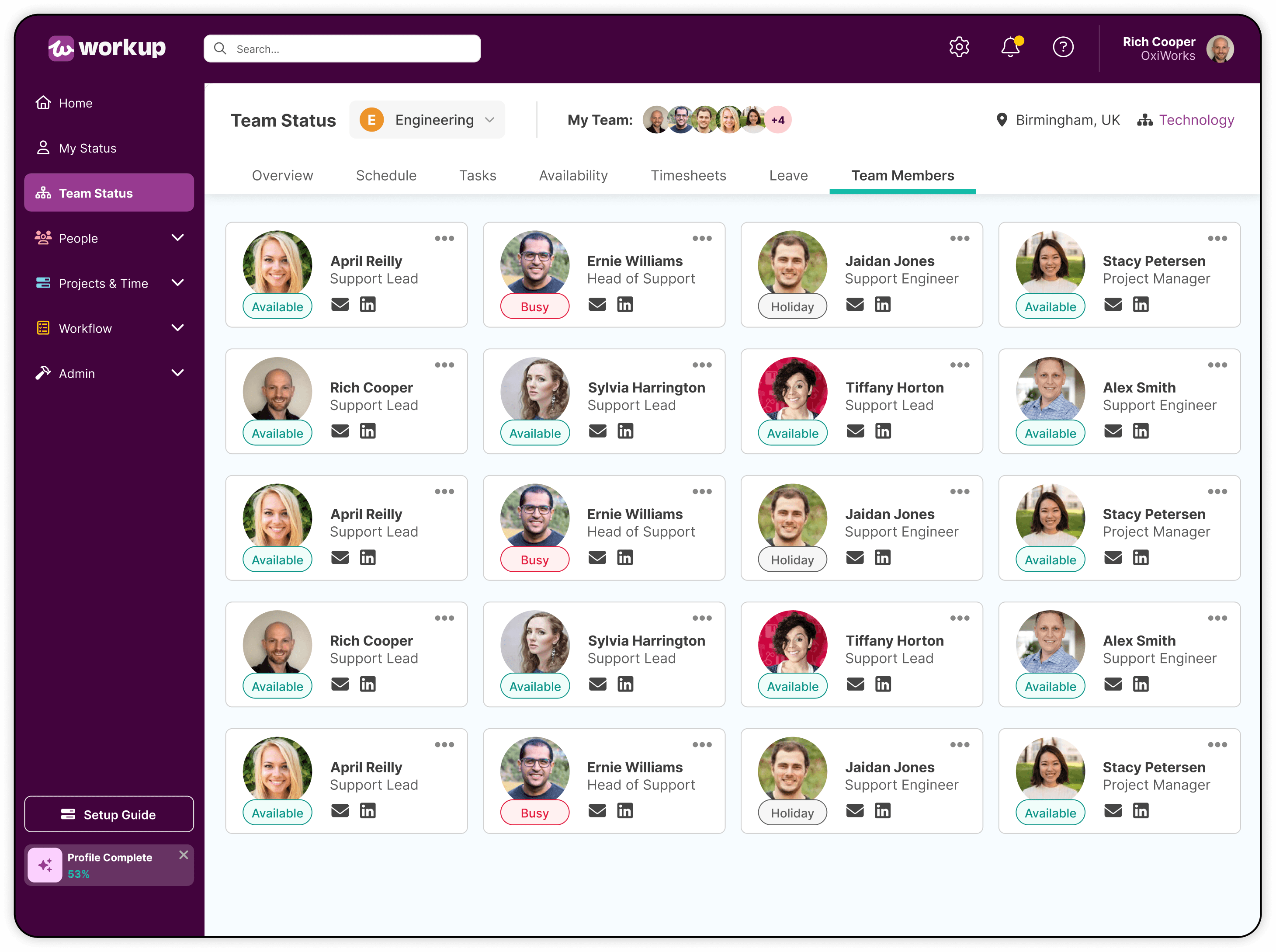
FINAL DESIGNS
Using the Design System as a foundation, the final interface was developed to create a consistent and scalable product experience. By creating various widgets & features, the user could customise their dashboard to their own specific business needs.
BUSINESS OUTCOMES
Following the redesign Workup continued to grow & received industry recognition, including award nominations for Startup of the Year & Excellence in Technology. By introducing vibrant branding, updating the UI & creating a structured Design System, Workup can introduce new features more efficiently & continue to grow their platform.